What drives bookings of accessible accommodation?

Accomable is a website which allows disabled travellers to find and book accessible accommodation. [Edit: Accomable were acquired by Airbnb Nov 2017]. They were interested in assessing how they measured up to market standard metrics, and also what drives the number of bookings, a key driver of growth in their business.

Metrics

Accomable was interested in tracking metrics recommended by a VC firm for market places.  The metrics look at buyers, sellers and the overall market place to understand how its growing and what could fuel further growth. I wrote Stata code to when enabled Accomable to select the months of interest and which populated a spreadsheet of the metrics broken down by month for the months selected.  This involved looping over the selected months for each calculation and using “putexcel” to refresh the spreadsheet.

Modelling Booking

One of the most important questions at Accomable is “what drives the number of bookings?” More bookings means more customers finding what they need on the site, and ultimately drives profit.

I was interested in answering this question from both the travellers’ and hosts’ perspective as the decision to book will be a combination of factors.  Some of that data we didn’t have access to, for example, the travellers’ specific circumstances at the time, for example, whether they’d just got a windfall or just really needed a break. But we had data about the travellers’ interaction with the site which is what is within Accomable’s locus of control anyway. The decision to book a particular property of course also brings in the characteristics of that particular property.

I had access to data on users, properties and bookings which I merged together. I then started engineering features, for example, on the travellers’ side:

  • I extracted whether the prospective traveller had provided their email address and / or phone number (which indicates a certain legitimacy of the booking enquiry)
  • I extracted the length of their message (Airbnb “design for trust” in suggesting the length of messages through the box size – too short a message may not show enough effort but too long a message may scare off a host!)

The characteristics of the property, such as having a step-free bathroom or a pool, were already well-delineated into features so there wasn’t much more to add.  Such characteristics are particularly interesting in this case given that disabled people often find it difficult to find goods and services that meet their accessibility needs.  I did add, however, a feature which indicated whether the property was popular – Accomable doesn’t communicate to travellers which are the most popular properties and so I used this feature as a proxy for underlying quality which isn’t observed in our dataset (and which makes it more likely to get a unbiased consistent estimator on the other variables).

I also extracted some features of the booking itself, for example:

  • The time between the booking enquiry and the check-in date (with the rationale being to understand whether last minute or pipe dream travel plans contributed more to the number of bookings).
  • The time of day that the traveller sent the booking enquiry (with the rationale being to understand the booking behaviour of the traveller e.g. are they getting bored at work in the mid-afternoon and being a holiday?)

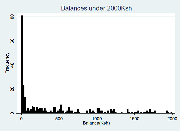
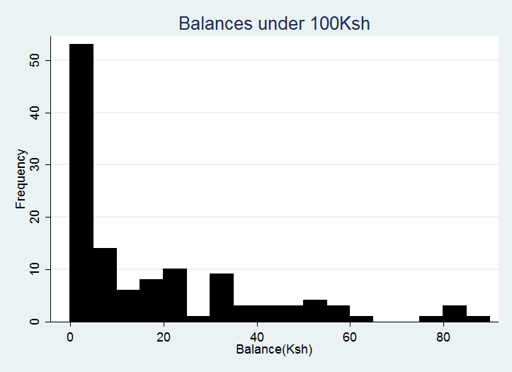
I then tried out a number of OLS regression models for the following dependent variables: the number of orders per traveller, the number of bookings per property and the price. The adjusted R squared terms ranged from 0.15 to 0.44 with the price models being the least stable (in terms of the coefficients varying greatly upon the inclusion of additional variables).

Findings

  • Bookings per traveller is higher if the traveller had booked a popular property (most popular that month) in the past, and also if they provided their email and their phone number (likely to be indications of seriousness of interest)
  • The number of bookings a property receives is much much higher when it’s a swap (this could be because it may be easier to trust that the property is suitable if the traveller is swapping homes with a host they know to have similar accessibility requirements), and when there’s an electric bed and a ceiling hoist (this suggest a scarcity in supply of such properties relative to demand).  Properties with an electric bed have, on average, 2.2 more bookings than properties without an electric bed.
  • Bookings were most popular at 12noon at 7pm, suggesting lunchtime and evening browses!

Recommendations

I recommended to Accomable to focus on recruiting properties which allowed a home swap, and also which catered for travellers requiring the more intensive accessibility features such as electric beds and ceiling hosts, which other websites are unlikely to be able to cater for. I also recommended focusing marketing emails during the popular booking times.

datascienceaccomable


Promoting Mobile Money in Kenya

“Mobile money” refers to mobile-based money transfer and savings services.  Mobile money has been around in Kenya about 10 years, and according to CCN, the biggest brand, M-Pesa, has 18 million active users in the country and has lifted 2% of Kenyan households out of extreme poverty.  Proponents of mobile money explain this by mobile money enabling safer and easier savings, and reducing financial barriers and transaction costs to starting a small business.  A competitor was interested in seeing how it could increase its market share.

The client conducted a survey about 399 individuals’ mobile phone and mobile money use. I was also provided with access to a snapshot of the same individuals’ mobile money transaction data. (I describe my approach to the data analysis below but if you’d like to skip to the presentation of my findings, here it is).

The data required considerable cleaning for removal of duplicates and correction of typos. I then visualised the transaction data. One of the most interesting things I found as I was exploring was that the balance on the mobile money accounts seemed highly skewed towards low balances.

balance1

So I zoomed in a bit…

balance2

These graphs gave initial indications that these particular customers don’t seem to use the mobile money accounts for long-term savings (the modal value of savings is 0-5 Kenyan Shillings (about US$0.05)).  The below graphs which show the deposits being low relative to receipts of money also suggest that the accounts are being used more to enable transactions than savings.

I linked the transaction data with the survey data to understand who the customers were, and their behaviour with regard to mobile phone and mobile money use. I used OLS regression (with accompanying tests) to model the costs associated with mobile money, and probits to model the probability of choosing a provider, of using their mobile money service and of starting using it within the last year.  I then hypothesised about the behavioural barriers to accessing the client’s mobile money services, and created some recommendations on the findings.

I was most interested to find that customers perceive that comparing prices between providers, switching providers and sending money to another network is difficult.  The customers were very familiar with the price of sending money, weren’t convinced to change networks by promotions and the most frequently chose a provider because they trusted them.  Because of the lack of responsiveness to promotions, I advised the client to focus on developing products which were relatively expensive or under-provided in the current market.

Please see the presentation of my findings.

(more…)

Previous Projects

Publications

I’ve been pretty lucky to have been involved in some awesome projects, and got to produce some publicly-available publications.

  • Valuing agricultural input and food system related costs to health, UN Food and Agricultural Organisation
    • The FAO were interested in a “full-cost accounting approach” to valuing agricultural inputs e.g. pesticides, fertilisers and food low in micro-nutrients.  In other words, taking into account the long-term, non-market impacts which are often ignored when agricultural decisions are made.
    • The brief was to develop a case study for valuing the impact on health through wellbeing valuation, a methodology which derives the impact of an outcome, in this case a health condition, on wellbeing through statistical analysis.  The key benefit of deriving the impact is that you get at people’s lived experiences instead of how bad they imagine the health condition to be (which is the case in the QALY, the most commonly used alternative method).
    • I wrote up some of the theoretical approach and examples to demonstrate the methodology.
  • Value-for-Money analysis, NCS:
    • NCS is a 3-4 week experience for 15-17 year olds to develop employability skills, take part in social action and stay away from home. More than 275k young people have participated since its inception.
    • To assess whether the 2015 programme was value for money, I assessed the short-term impact of the programme on the participants’ wellbeing through a difference-in-difference estimation.  Those who participated in the programme experienced a greater positive change in wellbeing compared to a control group.  I then valued the observed improvement in wellbeing through the wellbeing valuation methodology.
    • To assess the long-term impact of the programme, I used administrative data (UCAS Strobe and Exact) to assess the impact of the programme on entry to higher education. On average, the programme increased entry to higher education, and this was particularly pronounced for those from areas where young people are less likely to enter higher education.  I then valued the associated higher earnings.
    • I then compared these short-term and long-term benefits to the individual and to society to the cost of the programme.
    • The research was replicated for the 2016 programme and even makes an appearance on NCS’s Wikipedia page!
  • Valuing the impact of mental health interventions, HACT:
    • WEMWEBS is a scale used to measure changes in mental health, and it is used in the housing sector (and elsewhere) to assess the impact of mental health interventions.
    • The client was interested in being able to value the benefits of improved mental health so that interventions could be assessed in a cost-benefit framework.
    • I modeled the relationship between the WEMWEBS scale and life satisfaction to derive a value for a change from one score on the scale to another. I tried a range of parametric (linear, log, quadratic, cubic, sigmoid) and non-parametric models, and settled on a 12-category model guided by goodness of fit tests and theoretical reasoning.
    • As the model is not linear, moving from a 7 to an 8 doesn’t have the same value as moving from a 27 to a 28.  So I provided a table of values which allowed the client to calculate the value of a change from any value to another for each individual.
  • Australian Social Value Bank:
    • The ASVB is a “bank” of values estimating the benefit of various good outcomes to the individual. The benefit to the individual, whether it be improvement to their health, an educational qualification or regular contact with friends are evaluated with reference to the impact on wellbeing, and then valued using the wellbeing valuation methodology.
    • Using the same methodology to estimate the benefits of outcomes across a range of types of outcome (health, education etc) allows decision-makers to compare programmes on a like-for-like basis.
    • Of course, society also benefits when things are going well for people (people who are healthier cost the NHS less), and I contributed to the bank of “secondary benefit” values which show the increased tax revenue and reduced government spending of positive outcomes.
    • I was also in charge of developing videos to accompany the tool. Tune in to hear my dulcet tones!


A Playbook on How to Live Better

I’ve spent the last 8 weeks with a brilliant bunch of women* trying to figure out for ourselves what it means to live better. We’ve met once a week and given each other the time and space to explore such a question.  For some of us, it’s been at that question level, and others have been actively trying to change habits and get stuff done. Because I completely geek out on changing behaviour, I thought I’d try to create a bit more of a structured approach to achieving a goal which I’ve called a “playbook” (instead of a “workbook”) as these things are meant to be fun! Since my work with Simetrica focuses on wellbeing, the process starts with figuring out what is actually a worthwhile goal. The playbook takes you through the 8 weeks (as we had) and ends, very importantly, in a celebration! Please get in touch if you’d like to test and improve it.

Live Better Playbook

* the gender skew is due to self-selection rather than design!

Conversation Dinners

Back at university, I was lucky enough to go to and help organise a few “Conversation Dinners”. That’s odd – you may say – I usually have conversation at dinner – what on earth are you talking about?

A conversation dinner is a meal where you are paired with a stranger and work your way through a “conversation menu” – a menu of questions designed to get past the superficial chat.  You choose a question for yourself (which feels much less confrontational!) and learn a great deal about the other person and yourself along the way.  A group of friends wanted to try this in London, and so I asked each to invite a stranger to dinner and we “swapped”.  It was the first time I’d done it this way, and was a lovely way to meet some new strangers.

My favourite question of the night was “what do you worship?” We had been discussing atheism and then my conversation partner mentioned the David Foster Wallace’s quotation “There is no such thing as not worshipping. Everybody worships.” A great conversation ensued!

Conversation dinner.jpg

Improving Accessible Travel

Earlier this month, I ran a focus group discussion for the EU Travel Portal, a platform (currently in prototype stage) funded by the EU Commission which aims to allow passengers to plan, book and pay for all their travel across the EU. The idea is that all the different types of transport are in one place and it’s very much a door-to-door service. I was helping them out with a discussion group on making sure that the site provides the right information to allow passengers with limited mobility to travel also.  I learnt a lot myself so I thought I’d summarise my learnings here.

I expected the output of the session to be quite a straight forward list of “I need information on x to travel on a train, and information on y to travel on a bus”.  Whilst we did come out with that, much of the discussion revolved around trust. The participants regaled plenty of stories where the website or customer services had said “it’s accessible… you’ll be fine” and then… it wasn’t fine.  And such experiences aren’t just disappointing but can also be dangerous, like, when a participant got stuck getting on a train. Or isolating, like when a participant had to stay on the car deck of the ferry whilst his family had to go up onto the deck.  So what engendered trust? Talking to someone – a member of staff or a fellow traveler with positive experiences. A personalised email.  A platform with static information is not enough: it needs to also facilitate interaction with others.

I also came out being slightly overwhelmed by the scale of the task. We talked in minute detail about how small the step and the gap between the train and the platform would have to be to allow participants to use it.  It depended on so many things – whether they had someone with them, their risk profile, how crowded the train was, whether the step was up or down. We concluded that a full audit of all the stations across Europe with a standardised classification system would be needed. A huge task. It reminded me the importance of asking the question “Why hasn’t someone done this already?” A full audit of all the stations is not a technological solution, and is something which doesn’t scale – it just requires pure manpower (or womanpower).  But someone has to do it at some point to get all this information online. It reminded me of the Google Street View car going around street after street recording footage – something which doesn’t scale but someone had to do it.

Fingers crossed travel across the EU will get easier and easier… Here is the full report if you’d like to read more: EUTravel Focus group discussion accessibility


Behavioural Design HoldUp

behavioural design holdup

I recently did another iteration of the Behavioural Design HoldUp in London.  This time we focused on helping the Ministry of Waste (https://www.ministryofwaste.org/) who are helping clear plastic from the oceans and coastal communities by connecting waste pickers to the supply chain for recycled plastic.  They started recently and are focused on quite a large behaviour change – helping people start their own micro-business collecting plastic – and so it was an interesting challenge to dig our teeth into! Working with social enterprises just as they are starting off I think is the time when applying these principles can be most useful as it infuses it within the core of the intervention’s mission rather than being an add-on small nudge later on. I also find that sometimes early-stage social entrepreneurs can get stuck on an idea, and doing this type of workshop early on is a good way to pivot away from that first idea!

We started off with focusing on a habit of our own we wanted to change. I wanted to set the context in this way to a) give the participants something for coming; b) remind them how difficult it is to change our own behaviours and achieve what can seem like a simple change to make, and c) introduce the principles without a big lecture! We used BJ Fogg’s framework of creating a “Tiny Habit” – something very small and easy to do that we do daily triggered by something already within our routine and then celebrated when we achieve it. This fits in with his overall framework of people needing the Motivation and Ability as well as a Trigger to remind them to actually do the behaviour.  We had some fun sharing ideas of how to exercise in the morning and stretch and pursue passions like filming.

bj fogg diagram

Sam then talked us through the Ministry of Waste and also introduced us to the context of the Philippines (where she’ll be starting off the Ministry of Waste).  One of the challenges I faced when thinking through how to do the workshop is whether people would feel comfortable that they had enough knowledge about people’s behaviour half way around the world to think through how to go about changing it. Broadly, the principles still apply as we’re all humans but often the key insight is knowing the specifics. We solved this (not perfectly) by Sam answering whatever questions people had as we went along.

The main body of the workshop was people working in small groups in response to some questions built from the Behavioural Insights Team’s EAST framework (make something Easy, Attractive, Social and Timely), insights from Irrational Labs as well as the academic literature.  Working with some non-native English speakers and also non-behavioural-specialists helped me realise that I need to make some of the questions more accessible. One of the biggest stumbling blocks we could see was the low social status of waste pickers, and so it was key to change people’s attitudes towards waste as dirty and often unsafe to a respectful way to make some extra money at key times of the year when people are a bit low on cash, e.g. before / after Christmas, weddings etc.  One way to do so was to actually make it safer – provide think rubber gloves and other equipment as appropriate so that it’s not a trade-off between health and making money (clearly risking people’s health is not a goal of the Ministry of Waste!) The other way to make it more socially acceptable we came up with was making it more acceptable through community competitions incentivised by investment in the communities by the supply chain companies, and making churches out of plastic (symbolically important in making it ok for the most sacred building in the community) as well as developing it as a secure career path.  To make it attractive, we discussed cash in hand, surge pricing after particularly high tides, and a marketing campaign of picking up a better future.  To make it easy and timely, we talked about how they could could fit it into their everyday lives e.g. picking up plastic during journeys they are making anyway, collection of the plastic from the individual’s house for the early adopters, that the best time to do it might be different times than other jobs due to the tides.

IMG_2462

In terms of what I learnt, I underestimated how well people would respond to the questions based on dealing with emotions, for example, how to reduce people’s fears.  And I also underestimated how useful the “Guidance notes” were that I prepared as a bit of a second thought. They set the context for why we were asking the questions.  Asking “How do we make something attractive?” seems like an obvious question with some obvious answers but the guidance note explained that sometimes the long-term and / or societal benefits are obvious but that we need to bring them forward to the individual in that current moment when they’ve got so many other things to worry about or be distracted by. The next iteration may also have another stage where we try to combine a few ideas from the smaller discussions (maybe at random) and see if we can get them to fit together to increase their probability of success. Watch this space!

IMG_2465


Open Source Social Impact

This project is essentially creating a product to allow organisations to compare their social impact against other initiatives. I think there’s a big opportunity to turn the service of social impact measurement into more of a product so the more sophisticated approaches are affordable for the smaller charities.

The tool will provide pre- and post-intervention surveys, and an interface to load up the survey responses.  The end results for an intervention will be benefit-to-cost ratio of the benefit to the individual beneficiaries, and a comparison to the industry standard for that type of intervention (health, education, housing etc).

The product is guided by a number of principles which allow us to compare the causal impact of interventions across different sectors:

  • What we care about is the individual beneficiary and specifically subjective wellbeing (what the individual considers to make the good life) and everything else is instrumental (we use life satisfaction as the outcome).
  • The individual isn’t necessarily very good at predicting what improves their wellbeing, and so we make no assumptions about their ability to know this (we derive the impact rather than asking the individual directly).
  • What we care about is the causal impact of the intervention, not just trends associated with it (we compare the impact with a control group using difference-in-difference analysis).
  • Interventions aiming for the same outcome can vary hugely in their effectiveness (we use the organisation’s own data rather than averages for the type of programme).
  • We don’t know how the intervention has its impact and so we make no assumptions about the mechanism (we use an unconstructed value-for-money analysis).
  • Impact shouldn’t be evaluated in isolation but should also take into account the cost of delivering it and what you’re missing out on to deliver it (we show a benefit-to-cost ratio).
  • Impact evaluation should be available and affordable for organisations of all sizes (we make it free or subsidised for small organisations).
  • Better, comparable impact results mean better decisions (we plan to work with funders to drive money to the best interventions).

I’m currently using dummy data to build this, and interviewing small social impact organisations to see whether this would fit their needs.  If you’d like to trial your organisation’s impact measurement with this system, get in touch!