Vicky Clayton

I’m interested in understanding humans and why they do the things that they do. Partly because I find them fascinating and partly because I think it’ll give me the best chance in figuring out how to help solve some of our biggest challenges. Trying to understand has taken me from genetics, ecology, anthropology, sociology, demography, human geography, animal behaviour, psychology and economics to data science.


Current Projects

Previous projects and parked projects.

Data across disciplines

Having started as an economist and then transitioned into data science, I’ve been very interested in how to a) teach data science to economists, and b) what the disciplines can learn from each other.

A few weeks ago, I was assisting with some training (with Data Science Dojo) on behalf of the World Bank in Bucharest. The participants were mostly ministry of health employees from South America and Eastern Europe with a few externals too. With our usual bootcamps, the participants are mostly analysts or software engineers whereas the Bucharest participants were from more of an academic background, mostly epidemiologists and economists. I could see the objection forming on the lips of the economists “but it’s not causal!” And I could hear a few mumblings from the epidemiologists when it came to discussing precision and accuracy.  To avoid too much confusion over false friends and discipline sub-cultures, I put together two tables: one comparing economics / traditional statistics to predictive analytics, and another comparing epidemiology to predictive analytics.  Epidemiology isn’t my discipline but I had a little help from my friends (thanks Lizzie and Rosie!) and a doctor / epidemiologist on the course.

Economics / Traditional Statistics vs Predictive Analytics

Traditional Statistics Predictive Analytics
Terminology Independent Variables / Predictor

Dependent / Outcome Variable

Model = algorithm (+ parameters)

Features

Target

Model = algorithm + parameters + data

Focus Causal estimation – unbiased estimates of a treatment effect Prediction of an overall outcome
Data Often deliberate data collection (own or national surveys) More likely to use data collected in everyday operations
Algorithm Choice Depends on the data you have (e.g. time series, instrumental variable) Considers performance on prediction.  Also considers interpretability and computing time.
Approach for choosing variables Focus is to get unbiased estimates so can include IDs, time dummies etc.

More theoretical approach to choosing control variables. Check significance of adding individual feature.

Focus is performance on unseen data so can’t include IDs and time dummies.

Agnostic approach.

Include all but then prune back according to how much extra predictive power the feature adds.

Evaluate model Test for broken assumptions. Test for significance of added features. Look at the mean and standard deviation of multiple estimations of predictive performance.
Avoidance of overfitting In an ideal scenario, pre-registering our hypotheses. Test the model’s predictive performance on unseen data.
Example Which drug works to treat the malignant tumours? Is the tumour malignant?

Epidemiology vs Predictive Analytics

Epidemiology Predictive Analytics
Terminology (False friends!) Accuracy (estimate represents the true value)

Precision (similar results achieved with repeated measurement)

Bias (systematic source of error; source: selection or information)

Accuracy (model evaluation metric)

Precision (model evaluation metric)

Bias (systematic source of error; source: overfitting model to training data)

Focus Risk factors and disease outcome

Predict disease incidence at the aggregate level

Prediction of an overall outcome

Predict at the individual level

Data Often purposeful collection (10s – 100,000s) More likely to use data collected in everyday operations (100s – billions +)
Algorithm Choice Depends on the data you have (independent – Cox regression, Kaplan-Meier survival analysis) or not (linear, logistic, hierarchical)). Considers performance on prediction.  Also considers interpretability and computing time.
Approach for choosing variables Theoretical approach – research questions, is biological mechanism plausible for main effect and control variables? Use causal diagrams. Focus is performance on unseen data so can’t include IDs and time dummies.

Agnostic approach.

Include all but then prune back according to how much extra predictive power the feature adds.

Evaluate model Look at the significance of the coefficient on the variable.

Look at the confidence intervals around the coefficient.

Look at the mean and standard deviation of multiple estimations of predictive performance.
Avoidance of overfitting Test the model’s predictive performance on unseen data.
Example Assess odds ratio of lung cancer in smokers vs. non-smokers Is the tumour malignant?

Some of the differences are pretty superficial – different terminologies for the same concepts or the same terminology for different concepts. Some were due to more fundamental differences in focus, for example, the economists caring more about whether a particular policy caused a particular effect whilst data scientists (in predictive analytics) caring more about the overall predictive power of the model. This then translates into different data – if you really care about identifying a causal estimate, often that means paying to set up a study and collect detailed data with a small number of people.  Here the decision is often pretty binary ‘should we roll out this policy?’ and at a high level (e.g. making a decision on behalf of an entire borough or even nation). If you’re more interested in how to personalise the decision for each individual that you interact with, then you may have millions of decisions to make and your model needs to give an appropriate answer (which may be different) for each of them with the data available in the course of everyday operations (as a survey to every individual would be unfeasible!). Because you’re most interested in obtaining an unbiased estimate on the variable of interest in an economics study, you can bring in other control variables which would never get included in a predictive analytics model, for example, fixed effect and time dummies. In economics, panel techniques are a wonderful trick to control for unobserved variation but in predictive analytics including such variables would be akin to cheating as you’re not necessarily going to have to predict on the same individual.

So there are definitely good reasons to do with the focus of each discipline to explain the techniques diverging.  There are, however, some parts where I think the disciplines could learn from each other. Two aspects of a recent freelance project I completed illustrates this quite well I think. I was helping a membership company encourage its members to renew their subscription.

  1. Combining techniques: A colleague had previously built a predictive model to better identify members whose subscriptions were coming up for renewal but were at risk of terminating their membership. This helped the sales team focus their efforts on those they were at risk of losing. (Of course, it would be even better if we could create a model to predict those who were at risk of not renewing but would be responsive to a call but we needed slightly different data for that!) I then used panel techniques (which come from econometrics) to try to get closer to a causal estimate of what contributes towards the average member renewing their membership. Combining the techniques more commonly confined to different disciplines allowed us to target who and then have a somewhat better idea of what might encourage these individuals renew their membership.
  2. Holdout data: for the model trying to understand what contributes towards a member renewing, I withheld a proportion of my data to test the model against. Usually, in predictive analytics, because the focus is predictive power, the model is evaluated on how well its predictions perform on this unseen ‘holdout’ dataset (e.g. accuracy, precision etc, or more familiarly for economists,  R squared). However, because I was more interested in getting unbiased estimators on the possible ‘treatment’ variables, the overall predictive power matters less.  (Some phenomena are just difficult to explain with the amount of data available. To give you a sense of this – when I worked on identifying what contributes to wellbeing – often we’d be happy with R squareds within the 0.3 region which would be pretty bad performance if you were trying to predict wellbeing!) Because of this focus on unbiased estimates, I instead looked at the coefficients to see whether they changed significantly when running the same model on this holdout data.  I conducted paired t-tests of the coefficients of the models using the original training dataset and the holdout dataset. There was no significant difference at a 95% confidence interval between the paired coefficients. I have heard Spencer Greenberg speaking briefly about the use of holdout data in the field of psychology but couldn’t find too much online about how to best use holdout data helpfully in a different way given the different focus on unbiased coefficient estimation. So I’m very open to discussion on this!

Just a brief note on sample size and expense – I know one of the restrictions researchers (in economics and other social sciences) work within is budget for data collection.    Because the data collection is often tailored for the study in causal estimation studies, it is expensive and there often isn’t the appetite to collect much more than the required minimum sample size to detect the expected effect size due to budgetary reasons. Holdout data is usually about 30% of sample so you’d need to increase the sample size by 42% to get sufficient data to do a training / holdout split. I can definitely see there being pushback on this suggested change in technique because of increasing the cost of data collection for something that the discipline has not so far recognised as important. However, I would argue the added expense is justified. We have already made the decision to try to figure out whether a programme or policy is worth scaling up or continuing and justified the overheads of the evaluation.The additional amount for the data collection is likely to be much smaller than the 42% increase in the sample size as the overheads of the evaluation remain the same (the training and recruitment of data collectors, the data collection itself, the project management and the analysis).  Spending a relatively small proportion more would enable us to be much more confident that the results were not purely by chance.   The current solution in academia (a slightly different field to economics for impact evaluation) of pre-registering a small number of hypotheses and only researching those feels unsatisfactory in that it restricts us to our current knowledge base at the time of proposing the study and does not do justice to the exploratory nature of the research process. We often have a much better understanding of complex phenomena after exploring the data.  Trying to solve overfitting through pre-registration means that we have to commission further studies to explore the insights we picked up in exploring the data we already have.  Holdout data acts as another dataset to test those explorations.

I find it fascinating that these sub-cultures of using statistical techniques in slightly different ways have developed in different disciplines and would be very interested in talking more to people from these different disciplines to see what we can cross-fertilise!

Data science meets life: is there an evidence base for evidence-based policy-making?

Motivation

There’s generally been a big push in the UK in recent years towards evidence-based decision-making but relatively little research (as far as I’m aware) into whether or how providing evidence changes decisions of policy-makers making real decisions. For example, does evidence reduce confirmation bias or are decision-makers selective about which evidence they use and how much they scrutinise evidence they disagree with? Do decision-makers use a different process to come to a decision when there are evidence available to them? How do decision-makers arbitrate between conflicting evidence? How do decision-makers deal with a cacophony of evidence? How do they interpret the uncertainty and caveats associated with the evidence? I believe there’s a bit more research on best ways to present evidence (e.g. the importance of visualisations) but there’s still a long way to go before most of the evidence found gets presented this way.

So I’m generally interested in this question of understanding how providing evidence affects decision-making from a perspective of how to do it better so that we can get more evidence-based policy.

My intended plan was to compare green papers (initial policy documents in the UK) to ideals of evidence-based documents.  Unfortunately, green papers are not easily accessible via scrapping or an API (as far as I could investigate – please let me know if you know otherwise!). So I decided to focus my efforts on debates in parliament – a slightly different group of people who are less focused on selecting an evidence-based implementation of a policy but who are nonetheless involved in selecting which issues to focus on.  This prioritisation process no doubt involves other considerations than which issue they could have the most impact on, for example, what is likely to get them re-elected but I think is a useful exercise nonetheless.

Goal

My goal was to get an idea of how evidence-based each of the speeches were. So I compared how similar each of them was to ‘ideal’ evidence-based speeches, and used these similarity scores as a proxy for ‘evidence-basedness’.  I then used evidence-basedness as an input into quantitative models to investigate whether:

  1. Debates had become more evidence-based over time;
  2. Specific topics were more evidence-based.


Accessing the Data

Theyworkforyou provides an API to make parliamentary debates more easily accessible. I initially used this API but, on advice from Theyworkforyou, used rsync access all of the xml files from 1935 to the present day as the rsync method is faster.  I stored all of the xml files in an AWS volume. I parsed the data using BeautifulSoup and then stored it in a csv file once it was in tabular format. The format of the xml files changes over the years and so it was a little fiddly extracting the necessary information and required considerable error handling.  I selected debates from the years 2000 – 2018 to focus on the current evidence-based movement (although I would like to investigate how the evidence-basedness has changed over time too). This gave me about 800,000 speeches.

Preprocessing

To prepare the text data for analysis, I lematised the words. This made sure that plurals and conjugations of the words didn’t show up as different features.  I also removed stop words (e.g. ‘the’, ‘a’) which are effectively noise in the context of NLP. I then created a ‘bag of words’ with words and bigrams (two concurrent words) so that I could take into account negations (e.g. ‘not good’) and qualifiers (e.g. ‘terribly bad’).  I then translated this bag of words into a TF-IDF (term frequency inverse document frequency) matrix where each speech (‘document’) is represented by vector of words which each have a score. The score represents how frequent the word is in that speech relative to how frequent it is in other speeches. This gives an idea of how important the word is to define that document uniquely – words which are frequent across all documents in the corpora have a lower score than words which are frequent in that document but not elsewhere.  In making the TF-IDF matrix, I experimented with the parameters (minimum frequency, maximum frequency, maximum number of features) to pick up as much signal as possible whilst avoiding running into memory errors (my 100GB AWS volume was still struggling!) This gave me about 1200 features and so I needed to reduce the dimensionality.

I used LSI to reduce the number of features to a more manageable number of components.  Not only would this allow me to calculate the similarity more quickly but it might also pick up more signal.  I chose 300 components as a starting points for LSI, and would like to investigate further the optimal number using singular value elbow plots when I have more time.  I would also like to try NMF, and also to do more manual inspection of the speeches said to be similar to the ideal scientific ones. I am not too concerned about the interpretability of the components but would be interested to see whether my human intuition of which speeches are similar matches up better with NMF as a test of the model.

Following dimensionality reduction, I calculated a similarity score for each speech with my ideal evidence-based speeches. I then averaged across the similarity scores for each speech to all of the science lectures to take into account that there are different topics in the lectures and speeches (e.g. ) and I’m interested in the kind of language and argumentation used rather than the topic per se. The ideal evidence-based speeches were the Christmas lectures from the Royal Institution which are given to help increase the public understanding of science. I also used a bag of science words such as ‘research’, ‘data’ and ‘average’ as a simple comparator.

Have debates become more evidence-based over time?

I plotted evidence-basedness against time, and also calculated the Pearson’s correlation between evidence-basedness and time.  There was a significant, negative correlation between 2000 and 2018 but it was small (0.001*** for both the science lectures and the science bag of words), especially in comparison to the amount of variance in evidence-basedness in speeches.  However, I haven’t included any other control variables, and this would be the next step. I would also be interested in looking over a longer timescale to understand how this trend has evolved over time.

(Please note that Graphs 1 and 2 have the number of days ago on the x-axis and so show increasing evidence-basedness as you go back in time.)

Graphs 1 and 2


Recommending evidence champions

It may be that recognising and promoting those who use evidence in their speeches could improve use of evidence in others. To enable this as a strategy, I investigated which MPs or former MPs had speeches which were the most evidence-based. I identified two whose speeches were significantly more evidence-based than average: Joan Ruddock and Angela Eagle.  


How evidence-based are specific topics of interest?

I tested whether debates which mentioned Brexit were more or less evidence-based (on a smaller subset of the data on my local machine). Contrary to my expectation, they were significantly and substantially more evidence-based. This made me think about what type of results this analysis can give me. It can tell me whether more scientific language was used but says nothing about whether the claims are true. For example, in the Brexit debate, lots of numbers were flung around which have since been found to have very little evidence base.  It would be interesting to investigate whether I could pull in data from fact-checking websites to corroborate the facts which the MPs talk about. I would like to investigate whether these results hold using all of the data.

Conclusion

This project shows initial evidence that parliamentary debates in the UK became less evidence-based over the period 2000 – 2018 . I heavily caveat these conclusions due to the lack of inclusion of other control variables (I need to have a serious think about what else would be relevant and whether the data would be available – any suggestions welcome), that the data used isn’t focused on the words of policymakers themselves and that it is difficult to hypothesise an ‘ideal evidence-based speech’.  I imagine the results are particularly sensitive to the latter. 

Future Steps

I would like to use this project as a proof of concept for the use of text data in analysing how people talk about evidence.  In order to see whether the similarity scores are giving me an insight into the evidence-basedness of speeches, I would need to ask people with some expertise in evidence-based thinking to rate the evidence-basedness on a subset of the speeches and see how well this aligns with the similarity scores.  I would be interested in discussing what these experts also think is important in defining a speech as evidence-based and whether they can recommend other comparators as I believe the analysis would be highly sensitive to the comparators. It could be interesting also to look more broadly at whether such analysis can be applied to accessing the logic / rationality of someone’s arguments.

I would be interested in investigating the impact of the What Works Centres directly on policy documents (for example through a difference-in-difference analysis comparing pre- and post- set-up and subject) if I can access them easily in a systematic way, and also looking at trends of evidence-basedness over a longer time period.


Data Science meets life: optimising demand-side strategies

Motivation

The solar energy industry has had an average annual growth rate of 59% over the last 10 years.  Prices have dropped 52% over last 5 years and last year, solar accounted for 30% of all new capacity installed*. So things are going pretty well. The challenge, however, is that solar power is variable – the sun don’t shine all the time, not even in California! We can store solar energy in a battery and release it to meet consumption or sell it on to the grid or to peers.

Screen Shot 2018-04-15 at 17.04.22.png


The set-up is that there is a commercial building with photovoltaic panels and a battery. The building can use the energy from the grid, the photovoltaic panels or the battery to meet its energy needs.  Since the generation, consumption and the prices to buy or sell vary throughout the day, the composition of energy use and when to charge and discharge the battery is strategic according to how expensive energy is during that time period.

Goal

So the goal of this project was to be able to save the most money spent on energy over a period of 10 days whilst being able to meet all the energy needs of the building and not going outside the physical constraints of the battery. I used data from Schneider Electric, a European company specialised in energy management (as part of a Driven Data competition). I had the day ahead prices, and previous consumption and generation data for 11 commercial sites for 10 periods of 10 days. The concrete output was a suggested level of charge every 15 mins for each building.

Process

So my process was forecasting day ahead consumption and generation for each site, and then feeding this into a reinforcement learning process. My final success metric which I was optimising for was what percentage of money I saved through deploying this optimiser compared with meeting the energy needs of the building solely from the grid.

Forecasting

I forecast energy consumption using traditional time series methods such as AR, ARMA and ARIMA with machine learning approaches such as gradient boosting and an LSTM neural network. I engineered features to do with the time e.g. hourly, daily, weekly, monthly and seasonally. I controlled for the site but anticipate that the models would have benefitted from additional information about the site, and what the electricity was being used for, but the company didn’t provide this information.  Knowing the location of the site would also have allowed me to forecast energy generation with more accurate radiance data. (I did not forecast energy generation due to time constraints).

I compared the models using the mean absolute percentage error (MAPE), the most commonly used metric for forecasting because of its scale independence and its interpretability.

So here’s the table of the mean absolute percentage error for the different models.

 Table 1: MAPE on test data for 15 min ahead forecasts of energy consumption by model

Model MAPE on test data
Consumption – 15 mins ahead
Given Forecasts 4.01%*
AR1 20.96%
ARMA23 22.55%
ARIMA213 High (needs more tuning)
XGBOOST 13.40%
LSTM Neural Net High (needs more tuning)

As you can see, out of the models I created, the gradient boosting model has the lowest MAPE but there is still significant room for improvement. (The MAPE is lower than the gradient boosting model for the given forecasts but the error was calculated on training data and so is not directly comparable with the MAPEs on the test data for the other models).

Reinforcement Learning

I then fed the best forecasts for consumption and the given forecasts for generation into the reinforcement learning process. It’s broadly a similar approach to that which developed AlphaGo and which is used by DeepMind to enable robots to learn from simulations of their environment.

The optimiser chooses a charge at random, and receives feedback about how much money is spent on electricity at that timestamp, given the consumption, generation and price of electricity.

This repeats over a number of epochs.

As the epochs go on, the optimiser learns from what gave higher rewards over the entire time period considered and increasingly choses the charges at each timestamp that give the highest reward, in this case, which limit expenditure.  This approach is model-free in the sense that it doesn’t have parameters it learns => it would have to be run by the building management system every day to produce the day ahead decisions given the prices and the forecasts.

Screen Shot 2018-04-15 at 17.05.39

Results

On average, this approach save 40% of energy costs over meeting energy needs from the grid. However, there’s a lot more value left on the table and so in the future I’d like to better tune my forecasts for consumption better. For time constraint reasons, I didn’t try to forecast energy generation but that’s an area I’d like to work on. I wrote my own reinforcement learning algorithm which was a great learning experience but there’s an implementation in keras of deep reinforcement learning which I’m sure is better optimised and deep reinforcement learning tends to better handle states it hasn’t seen frequently before.

* https://www.seia.org/solar-industry-research-data


Metis Weeks 2 and 3

Week 2 started off with a pair programming challenge on HTML to ease us into web scraping.  Web scraping has been my favourite part of the bootcamp so far – it’s so empowering to be able to turn something you come across every day into data you can use. This allows you to “peer under the hood” a bit at websites you use every day.  For example, one of my peers thought it was odd that products with low rankings and a low number of reviews could make it onto the first page of an Amazon search.  Being on the first page is a boon to sales as customers rarely bother to go beyond the first few search pages so it seemed consumer welfare was taking a hit with the current arrangement. Being able to take a stab at answering such questions about large organisations that are incredibly protective about their data (even if you have not as much success as you’d like in answering such questions) is pretty cool!

We spent most of the Week 2 and all of Week 3 on linear regression and its interpretation, using it as a first step into setting up a pipeline of scraping data, modelling a continuous variable, validating the model using various metrics (R squared, RMSE, MAE) and then testing it against holdout data. I really enjoyed a pair programming exercise where we effectively conducted gradient descent manually before learning about it theoretically – I thought it was a really good way to develop our intuition around it. I also really enjoyed better understanding regularisation through looking at it geometrically – deliberately limiting the space in which we allow the optimisation to occur to avoid making the model “too optimal” and overfitting.

We also learnt a bit about hypothesis testing, and I was keen to emphasise when you can infer a causal relationship – I didn’t leave my Economist training at the door!

The conclusion of these two weeks was a project scraping data from a website and then modelling a problem using linear regression and this data. You’ll find the write-up to my project here.


Data Science meets life: finding a car

Challenge: Having just moved to San Francisco, I needed to find a specialist car which was wheelchair accessible (my partner needs to be able to get in the back still on his wheels!) I was shocked at the prices at a local specialist dealership (where the cheapest, oldest cars start at $30k…)

Solution:

  • Predict how much a car should cost on the basis of characteristics you’re generally told when you’re buying (age, brand, engine size etc)
  • Compare similar cars at the dealership and on Craig’s List to see how much of a mark-up there is.
  • Build a searchable web app with a search function suited to searching for additional accessibility features.

The first step was getting the data on which to build the model. Having scraped the listings website of a local specialist dealership, I ended up with a list of c.600 cars, their price and their characteristics.  Hmm, not enough data to do much validating and testing with. So I scraped all car and truck listings across the US on Craig’s List. This returned c.80k listings. Now we’re in business! It returned such beauties as…


old car

So I restricted it to cars that were at least driveable, and iteratively added features to train my model, and tested whether it reduced how far off the mark I was. The most complex model I tested was a linear regression with polynomials of order 2 and interaction terms.   The next stage is cross-validating my model. With just training and test datasets, I was at risk of learning too much from the test dataset and overfitting to it. Watch this space!

See a technical write up of my progress so far here and my presentation of the project here.

Metis Week 1: The Whirlwind

Metis is an immersive data science bootcamp, and is what’s currently keeping me busy and out of mischief. The first week has flown by and has given us a whirlwind tour of visualisations (using Matplotlib and Seaborn) and data analysis (using Pandas) as well as pair programming and our first project.

One of my favourite parts of the week has been starting each morning off with pair programming.  Even more so as we were introduced to the method through this brilliant video, making it analogous to spooning. I’ve learnt SO much from my fellow classmates (I’m hoping I’ll be able to repay the favour at some point!) Emy got me thinking about the complexity of my function and how I could reduce it.  We were dealing with a pretty simple case but he counselled wisely to design the function to be able to deal well with more complex cases. Taking into account complexity has been probably one of the biggest shifts in my thinking as it’s pushed me to think through different ways of doing things rather than just what works.  Michael recommended that we test edge cases to see whether there were any limitations to the function we’d written.  We consequently discovered that it didn’t work for the numbers at the start and end of the range, and that got us rethinking (when we otherwise would have assumed that we’d got the solution and sat back on our laurels). Davis was teaching me all the shortcuts. It’s a brilliant feeling that I have the opportunity to learn from talented peers 🙂

We also completed our first project, which was a pretty steep learning curve in figuring out how to split up tasks, and organise the workflow of the team.  Because of  the tight deadline, we were working in parallel to bring in necessary additional data, clean the data, analyse it and visualise it. So those doing the latter stages worked with dummy data to begin with.  This works to a certain extent but reduces the ability to be responsive to what you find in the analysis to figure out what’s interesting to focus on and explore.  There were also massive overheads in working together without Git as we spent most of Sunday afternoon aligning our code and debugging compatibility issues.  (The team generally wasn’t comfortable with it and we were using Jupyter Notebooks which are saved as HTML files and so version control for the Python code ended up being a nightmare. In hindsight, we should have used Notebooks as our playground, and then version controlled them as plain Python files.)

A quick write-up of our first project (about the ubiquitous challenge of finding housing in the crazy city of New York!) can be found here.


Data Science meets life: finding a New York apartment

Challenge: imagine you’re moving to New York and you have a week to find a place*.  You want to live in a “hip” neighbourhoods but not get ripped off.

You find a list of 10 up and coming neighbourhoods by StreetEasy… 10 – you see!  But you only have a week! Time to use your data science skills to find the MOST up and coming neighbourhoods to focus your search on.

2018-Neighborhoods-to-Watch-Map-5812d4

Solution: After a short amount of pondering, you reckon that lots of people go out in the evening in hip neighbourhoods and that’s an early indication of an awesome place to live. Think Shoreditch or Brixton for the Londoners. SO you download open data from the New York Municipal Transport Authority and look at people leaving the subway in the evening. It’s either people going out enjoying themselves or people heading home (and hopefully enjoying their homes!)

Outcome: You find that Elmhurst is trending downloads… What happened to its popularity in 2016?! (Note to self: investigate more. Murder? Really bad Zillow review?) Don’t go there! Fort Greene and Woodside seem to be the places to go! Right, now out to explore the streets of New York!

Full write-up and presentation.

* I’d actually just moved to San Francisco and encountered a similar challenge but NY has awesome open data!


Tea With Strangers new directions?

In Autumn last year, the Tea With Strangers London hosts were sat around a table full of food and tea, and contemplating the minds of strangers. We were trying to figure out why people cancel last minute or don’t show, (which, as you can imagine, is disappointing for us!)  and also turned our analysis on ourselves as to why we’re sometimes a bit slow to organise teas (which, as you can imagine, is disappointing for our strangers). Since the tools of my trade are research ones, I rolled up my sleeves and a) analysed our participation data, and b)  conducted qualitative interviews with some of our hosts and some of our strangers.

The numbers are reasonably small, and the direction of causality of the quantitative analysis is reasonably difficult to interpret but the queries did provide lists of groups of participants by characteristic (including one participant who’d cancelled last minute 17 times!) which made it easier to select participants to interview.

What I learnt most from the interviews is that each host conducts their teas very differently, and it’d be useful for new recruits to co-host (in a “Community-Tea”!) with experienced ones to see the range of approaches and find their unique style. For the full write-up, please click here.

IMG_3753


Model Metrics in Singapore

I helped teach the Data Science and Data Engineering Bootcamp by Data Science Dojo in Singapore earlier this month. I came away with a refreshed appreciation of the importance of randomness which pops up frequently in techniques, and also a renewed love for ensemble methods.  One of the things that students consistently found difficult was getting their head around the different evaluation metrics so here’s my attempt to explain and simplify.

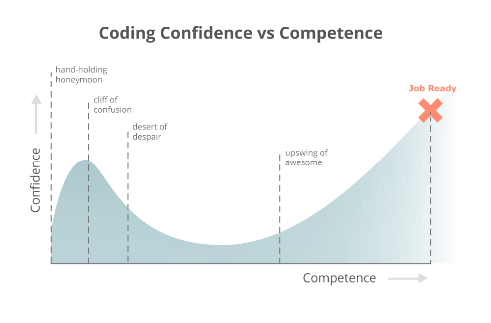
One of the things which always surprises students is being able to write a machine learning algorithm in one line of code. How could it be so easy, they ask? And then we start to ask: is this model any good? What do the metrics tell you? And then students fall from the cliff of confusion very much into the desert of despair.

coding_is_hard_confidence_competence

Binary Classification Metrics

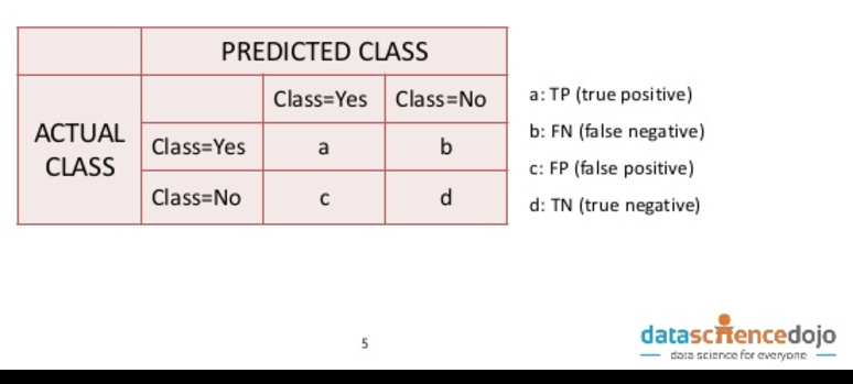
So a binary classification model predicts “yes” or “no” for an observation, for example, “is this a fraudulent transaction?” or “does this person have a disease?” There are 4 states of the world:

  1. You guess “yes” and it’s a “yes” – yay!
  2. You guess “no” and it’s a “no” – yay!
  3. You guess “yes” and it’s a “no” – less yay…
  4. You guess “no” and it’s a “yes” – less yay again…

These states are often put into a table called a “confusion matrix” (one hopes this is named ironically..!) and are said to be “true” if the actual class matches the predicted class, and “false” if it doesn’t.

confusion matrix

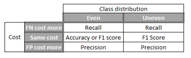
The simplest metric is accuracy: out of your predictions, how many are correct (true positive + true negative / total)? But accuracy turns out to not be a good measure for rare events. Sticking with the example of fraud: say 1 in every 1000 transactions is fraudulent, and you predicted that they all were fraudulent as a simple starting model, the accuracy of the model would be 99.9%. Not bad, right? But actually not helpful in giving you any action to take.  As data scientists, we need to be aware of multiple metrics because data sets differ in two key ways:

  • The ratio between positives and negatives (“the class distribution”) => this is rarely 50:50;
  • The cost of wrong observations.

Accuracy is only good for symmetric data sets where the class distribution is 50:50 and the cost of false positives and false negatives are roughly the same.  For example, if you were trying to predict whether someone is female (ignoring non-binary people for the sake of the example!) where there are roughly equal numbers of males and females, and the cost of a false positive (when you mark someone as female but they are actually male) and a false negative (when you mark someone as male but they are actually female) are about the same.

Precision looks at the ratio of correct positive observations to all positive observations (true positives / (true positives + false positives).  You improve precision by reducing the number of false positives. It is a measure of how good predictions are with regard to false positives and so is useful when false positives are costly. For example, whilst it may seem useful to detect as many cases of a disease as possible,  if the cost of the treatment had serious side effects, you may want to reduce the number of false positives that you subject to the treatment unnecessarily.

Recall / sensitivity is the ratio of correctly predicted positive events (true positives / (true positives + false negatives)). It is a measure of how good predictions are with regard to false negatives and you improve it by reducing the number of false negatives i.e. missing true cases. You will want to focus on improving recall / sensitivity when the cost of missing a case is big, for example, in predicting terrorism.

The F1 score is the harmonic mean of precision and recall – this is for cases where an uneven class distribution matters and if false positives and false negatives have similar costs. For example, in the case of tax dodgers (few relative to population i.e. an uneven class distribution), it may be equally costly to miss a tax dodger (due to the lost tax revenue) and to accuse someone of dodging tax (due to the undermined trust). You take the harmonic mean instead of a simple mean because the denominators for calculating precision and recall are different, and so it doesn’t make sense to calculate a simple mean*.

You can also have other combinations of precision and recall which reflect how much you care about each. This is known as the F-beta where beta is how much more you care about recall. This is then useful in translating actual costs of false positives and negatives into the metric. For example, say the cost of falsely identifying an employee as leaving their role costs the company $1,000 in a pay rise, and the cost of missing that an employee is leaving costs the company $10,000. in replacing them, then you’d use an F10 score as the cost of the false negative is 10x the cost of the false positive.

The important thing to remember in all of this is that whichever type of error is more important or costs more is the one that should receive more attention.

In cross-validation, you’re running the algorithm on multiple samples of the data and so it creates lots of values for the metrics. Look at the mean and standard deviation of the metrics.  Ideally, you want a high mean (accuracy, precision, recall / sensitivity, F1 score) and low standard deviation which suggest low bias and low variance respectively BUT there is a trade-off between bias and variance which means that you’re always looking for the sweet spot between low bias (illustrated by the high mean) and low variance.  As you increase the model complexity you decrease the bias but if you go too far you end up overfitting and increasing the variance. If there is a low standard deviation but also low mean you can increase the complexity of your model. If there is a high mean but high standard deviation also it probably means that you’ve overfitted your model.

Practically speaking, you can decrease the complexity by doing things like reducing depth, increasing the minimum number of samples per leaf node or decreasing the number of random splits per node in tree-based models. Do the opposite to make your model more complex.  I would highly recommend trying to change one parameter at a time and observing the change to the mean of which metric you’re using and the standard deviation.

The table below summarises how to choose the evaluation metric:

evaluationmetrics (2)

Continuous Variable Model Metrics

When predicting a continuous variable, the idea of being right or wrong for each prediction doesn’t really work.  As an example, if I have the task of predicting the height of a group of people, I am not predicting “are they exactly 170cm tall?” The answer for pretty much everyone would be “no”. So I have to predict a height for each person depending on their characteristics.  This is a rather sad way to put it but predicting a continuous variable is about minimising how wrong you are. For this reason, the above framework of true positives and true negatives doesn’t really work.  So we need to turn to some other metrics to evaluate how good our continuous model is.

RMSE is the root mean squared error. It is calculated by taking the difference between the square of predicted variable, say house price, and the square of the actual house price, and then taking the square root. It gives you an idea of how far the predicted values are from the actual values. The fact that it involves squaring the predicted house price and the actual house price means that the RMSE overweights large errors in prediction. This is important when predicting well on outliers is particularly important.

If predicting on outliers is not important (e.g. if they probably represent measurement error in your equipment) then you can use MAE (mean absolute error) which is just the average of the difference between the predicted value and the actual value.

In practice, the RMSE and MAE are used less commonly than R squared (also known as the “coefficient of determination”) as R squared is standardised.  R squared is effectively the ratio between explained variation and total variation observed. The values of R squared are only between 0 and 1 with 0 being the worst model (no variation explained) and 1 being the best (all observed variation explained by the model). (Well, actually the R squared can go below 0 but this would mean that your model would explain less than simply guessing the mean which is terrible!) The fact that R squared is standardised means that it’s a lot easier to develop an intuition around whether it indicates a good or a bad model compared with RMSE and MAE.  One thing to note is that the R squared always increases when you more variables to your model.  The adjusted R squared  adds a penalty for every variable you add so that you don’t overfit. The disadvantage of the adjusted R squared is that it weights each parameter added equally and so doesn’t take into account that adding x3 may be worthwhile because it explains lots of the variance but adding x6 isn’t worthwhile because it’s not adding that much.

*See the second answer on this stack overflow.